
Hopefully you’ve read (and enjoyed) my review of the Liverpool 12/13 home shirt (Part 1, Part 2). Heres a little bit about the away from the same year.
The reason I started this blog was because I became fascinated by the stories a football shirt can tell. Well, that and a desperate need to justify my ever growing collection to my girlfriend (“We can’t take these shirts to the charity shop, love, strangers on the internet like reading about them.”).
Every shirt detail and styling flourish tells a tale, and the most fascinating ones are the shirts that draw on local culture or regional heritage. After all, football is based on tribal rivalry, so a perfect strip need to represent the area it’s from.
If you were asked to name 100 things about Liverpool, the docks might be quite near the top, probably somewhere between the Beatles, our football teams and that kid who said ‘Accrington Stanley?’ in the milk advert years ago. It makes sense then that Warrior would want to pay tribute to Liverpool’s maritime heritage in this kit, deciding to “draw strong parallels from the uniforms worn by the Liverpool dockyard workers who plied their trade at the Mersey docks”.
In any case, there are more stylish Scouse cultural references that could’ve been used for inspiration. Perhaps we could have had a kit influenced by the psychedelic military jackets worn on the cover of Sgt. Pepper. Or maybe something based on the suits that the ‘Spice Boys’ wore at the ‘96 FA Cup final.
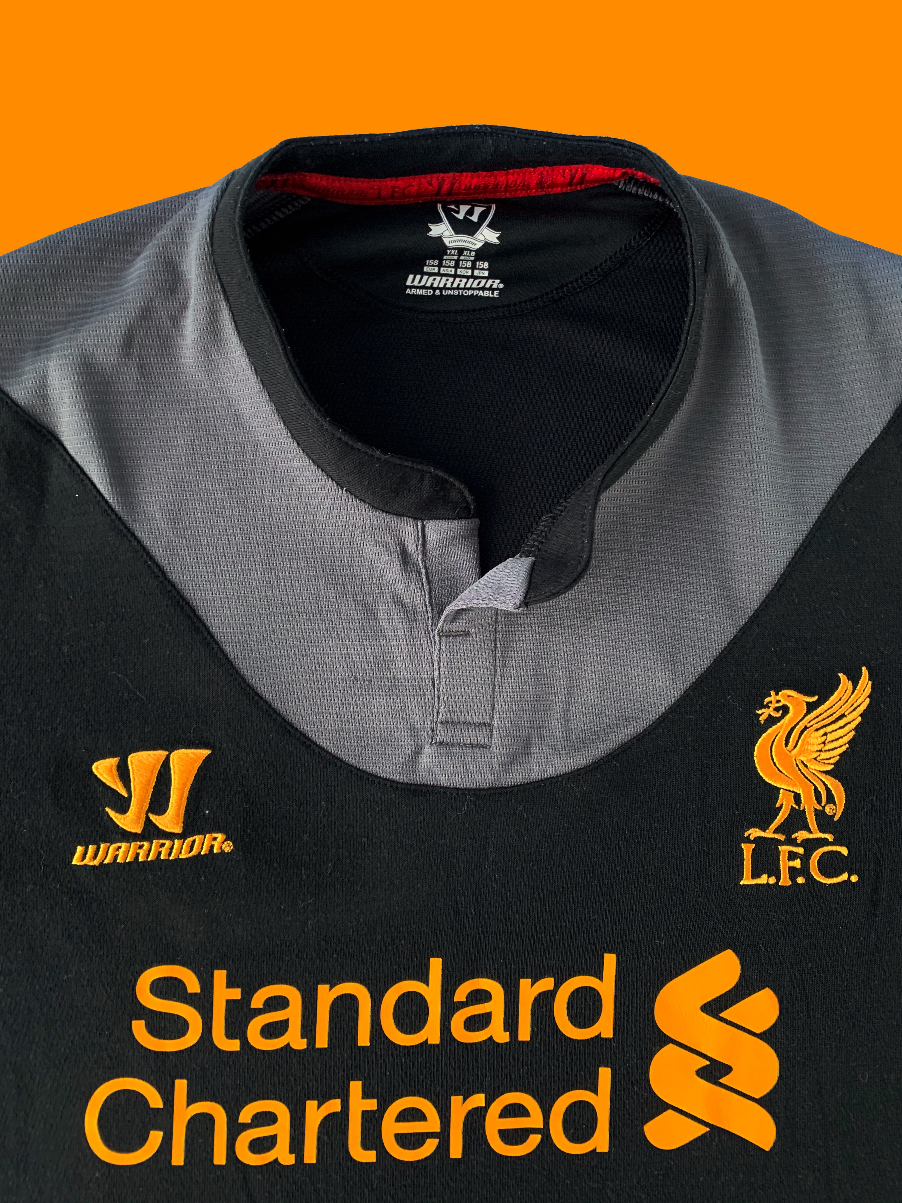
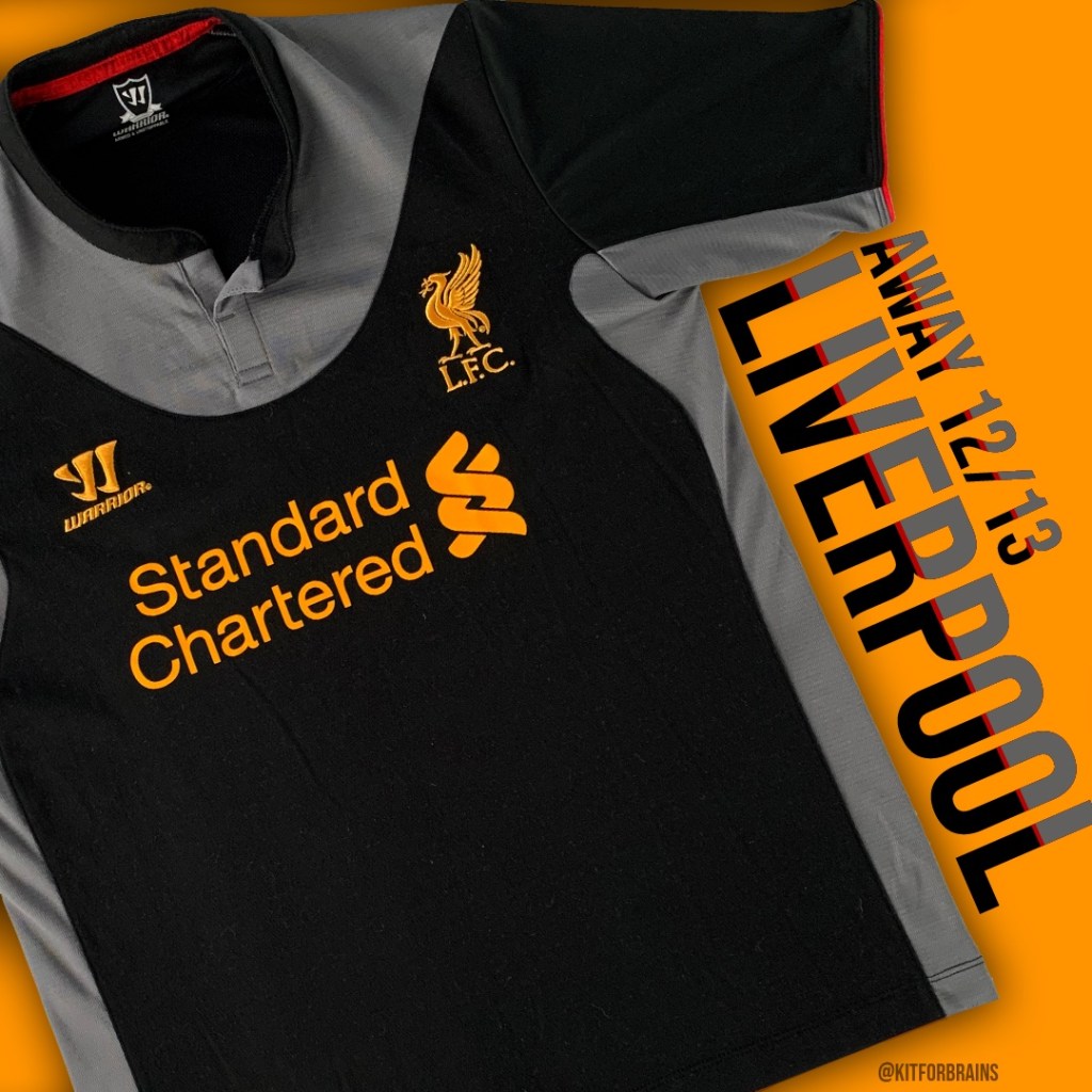
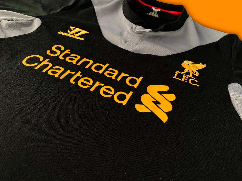
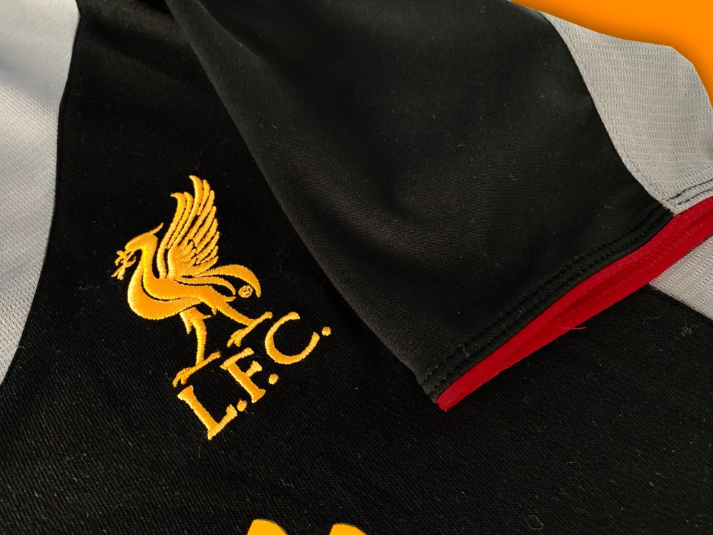
Warrior instead rewound the clock over 100 years to emulate Liverpool’s 1900/06 change shirt. Both old and new shirts feature a ‘yoke’ (a different coloured piece of material around the neck and shoulders) but while the original was red on white, the yoke on this new one is a much more subdued ‘Raven Grey’ on black. We’ll ignore that ravens are actually black.
Liverpool famously had grey kits back in the late 80’s, but had only introduced black to their shirt palette 10 years previously, when Reebok used it for the 2002 away. Like that kit, this 2012 shirt uses red piping to break up the monochromatic theme but then adds amber detailing in the form of the sponsor and badges.
However, these flourishes aren’t enough to overcome the overall lack of vibrance, which makes the kit look like Batman’s pyjamas. The on pitch performances were similarly uninspiring, with Liverpool picking up just 3 league wins while wearing it. So in future, when people ask what Liverpool is famous for, this kit probably won’t make the list.
If you liked this, remember to follow @kitforbrains on Twitter and Instagram!

Leave a comment