Hopefully you’ve read (and enjoyed) my review of the Liverpool 13/14 away shirt. Heres a little more about the details.
If Twitter was around in 1991, I think Arsenal and Adidas would’ve locked their accounts when the all the angry Gunners logged on to tell them exactly what they thought of Arsenal’s new away kit. “Why does it look like its been run over by a truck tyre?” they might’ve said. “Does it need to be so fussy? We just want yellow with a little bit of blue”. Time is a great healer though, and the ‘Bruised Banana’ is now extremely sought after, worth over £400 in good condition. And for that reason it might be worth picking up a 13/14 Liverpool Away kit, now.
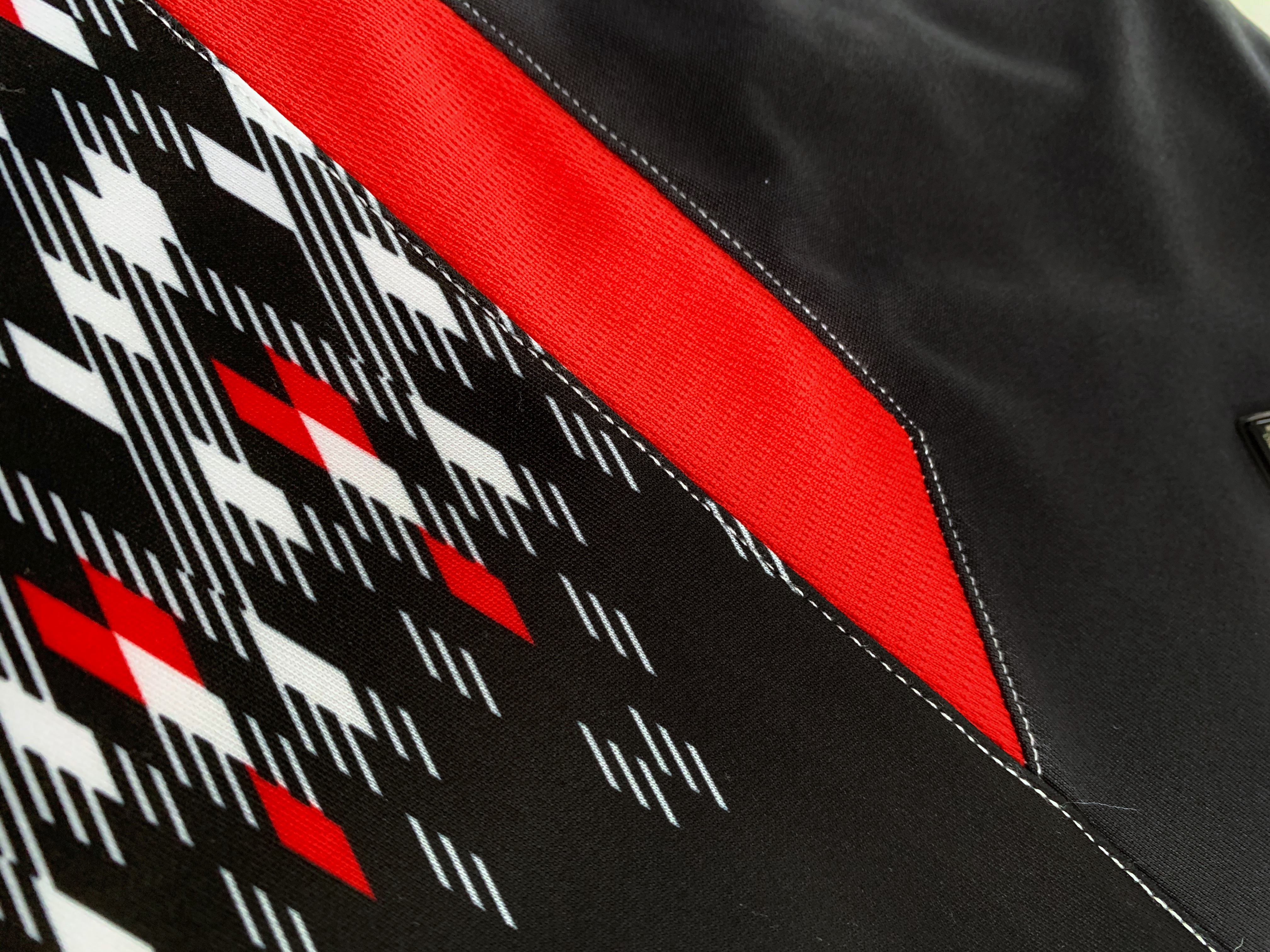
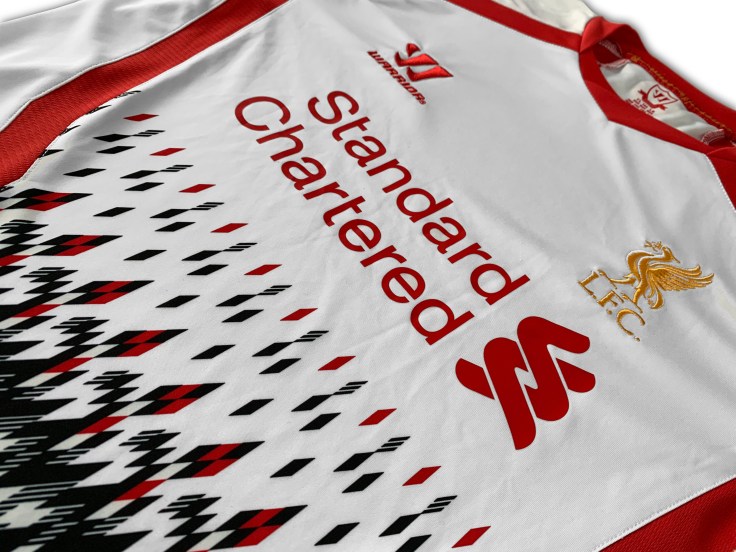
Like the Bruised Banana, this shirt didn’t win many fans on its release because of its controversial styling. The diamond pattern at the bottom of the shirt is described as “eye catching” by Warrior, which is true, because like a car crash you can’t stop looking. The pattern is a “refreshed interpretation of the graphics featured in the 1989-91 away strip” and not, as previously thought, “an interpretation of TV static drawn by someone tripping their nuts off on LSD.”
Liverpool manager at the time, Brendan Rodgers, said –
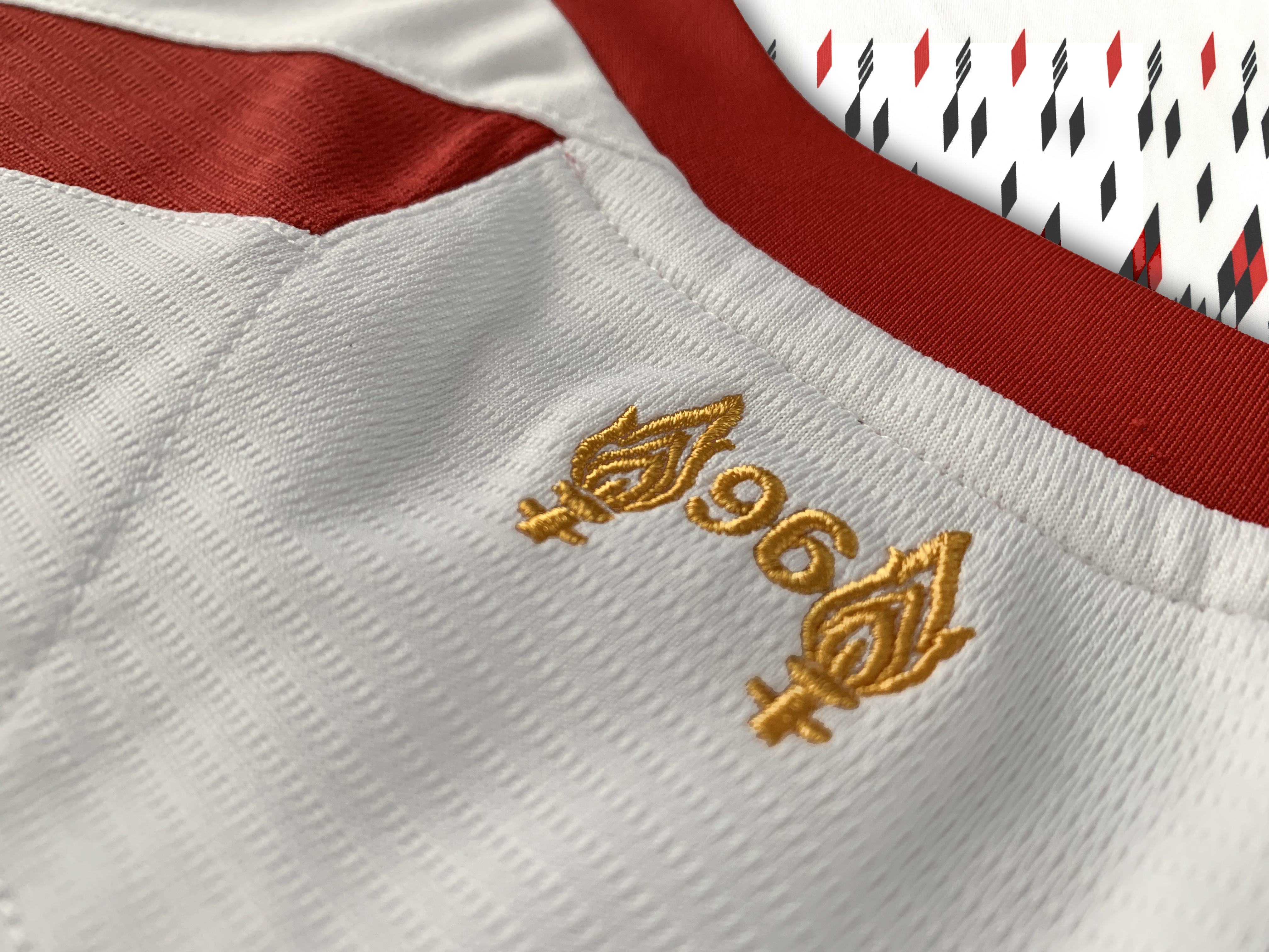
“A football strip fuses a team together; it is a Club’s uniform for players and fans. The fact that glimpses of the Club’s history appear in this kit is a really nice touch from Warrior“
We have to assume he meant this sarcastically, as the shirt only united LFC fans in hatred. And also notice that he doesn’t explicitly say he likes the kit either.
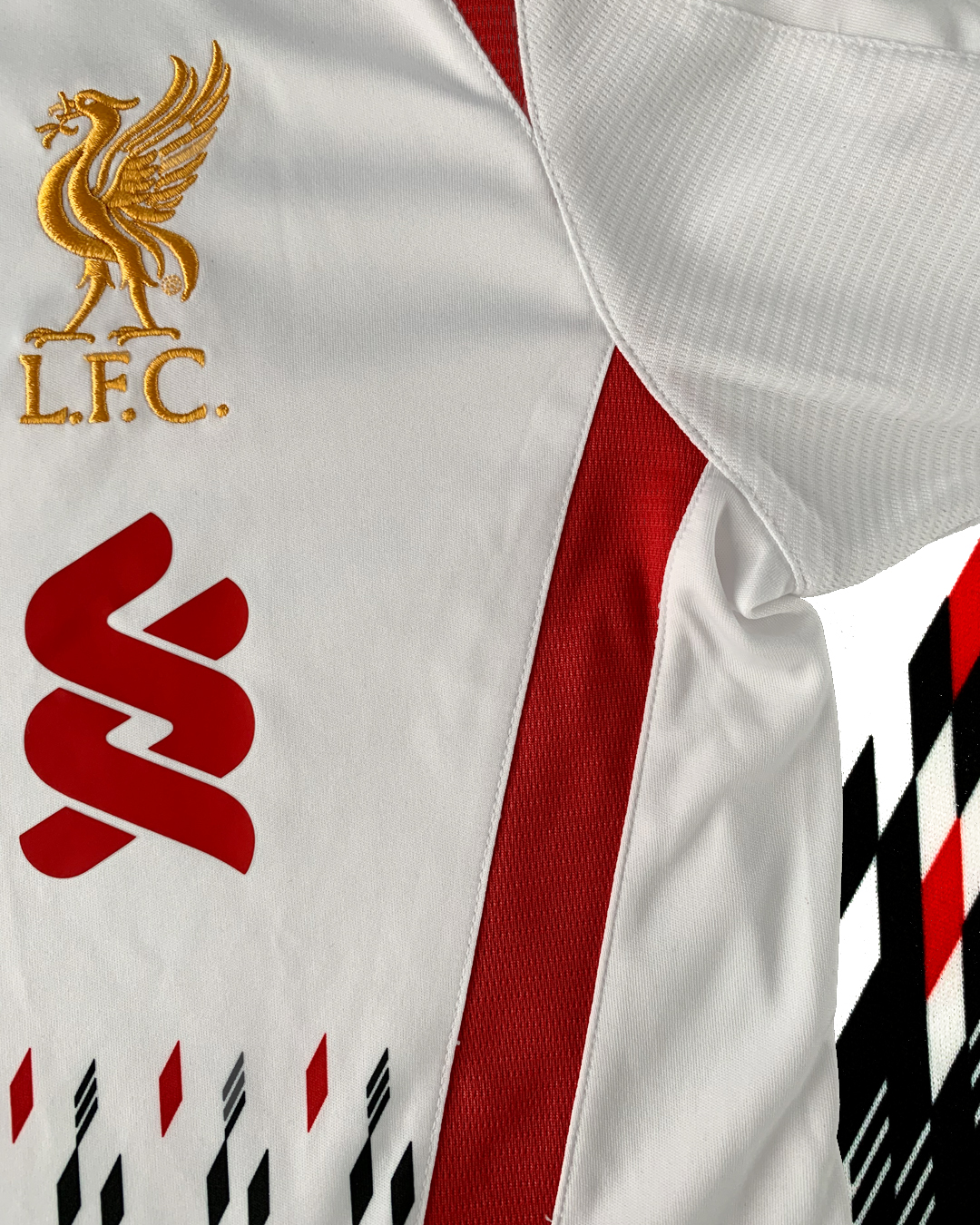
If it was only the bottom of the shirt that was the problem, you could just cover it by wearing a pair of dungarees, or fishing waders maybe, and everything would be fine. But even the top of the shirt isn’t free from Warriors overwrought styling. The neckline is based on the ’81 away kit, but “reworked to give the shirt a contemporary edge”. And if theres one thing this collar has, its edge. Lots of edges in fact, it looks like half finished origami.
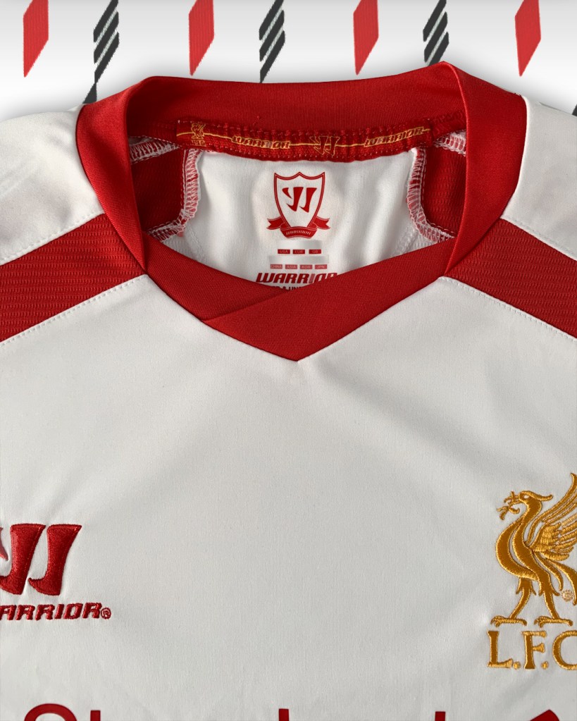
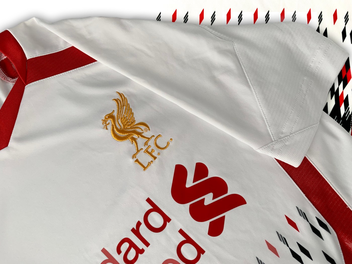
The Warrior logo and Liverbird crest are both embroidered in red and gold respectively, while the sponsor is printed on. The pattern is sublimated into the fabric, mercifully only on the front.
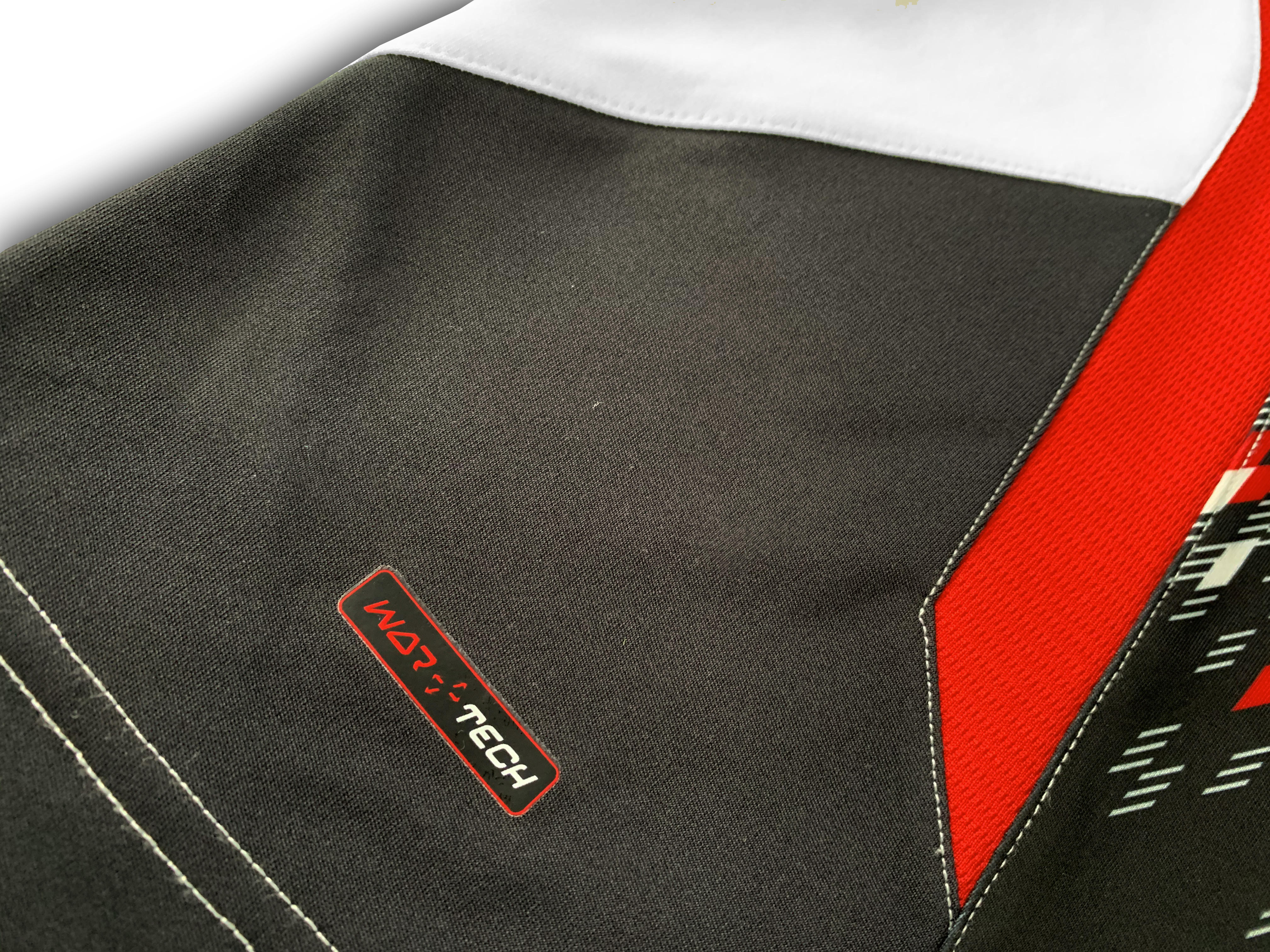
The shirt is made with Warriors ‘War-Tech’, which means the fabric is breathable and moisture wicking, and in addition has ventilation and stretch panelling to make the shirt flexible and comfortable during activity. I’ll have to take their word for it, last time I did any exercise was in PE twenty years ago.
Like last weeks shirt, I don’t think you need this shirt in your collection unless you’re an LFC completist. Its not cheap or plentiful enough to buy on a whim and not stylish or retro enough to wear as a fashion statement. But if you do buy it, and have the patience, in 30 years you might have the next Bruised Banana.
(No promises.)
Opinion from a non football fan (A.K.A Mrs. Kitforbrains): “I think I drew that pattern on MS Paint when I was a kid. I don’t like it.”
If you liked this, remember to follow @kitforbrains on Twitter and Instagram!

Leave a comment