Template shirts. A divisive subject for any football fan, but even more so for kit enthusiasts. Are they a necessary evil for manufacturers to keep costs down, or is it the supplier trying to push its own brand at the expense of the team?
After all, a teams kit is their signature, so seeing another squad running around wearing the same shirts (even in a different colour) will give you an identity crisis.
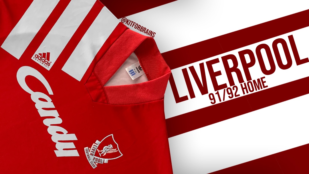
And if theres one thing Liverpool didn’t need in 1991, it was an identity crisis. Finishing second in the league after winning the title the previous year, combined with the departure of Kenny Dalglish had left Liverpool with a mountain to climb.
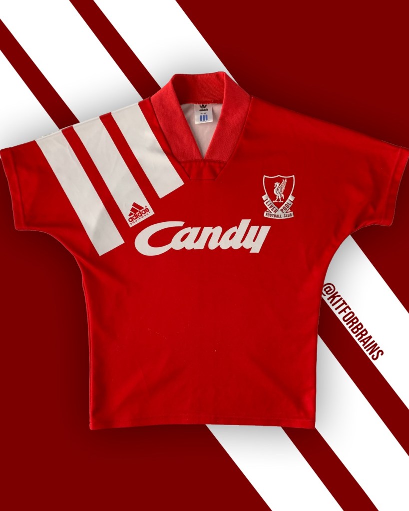
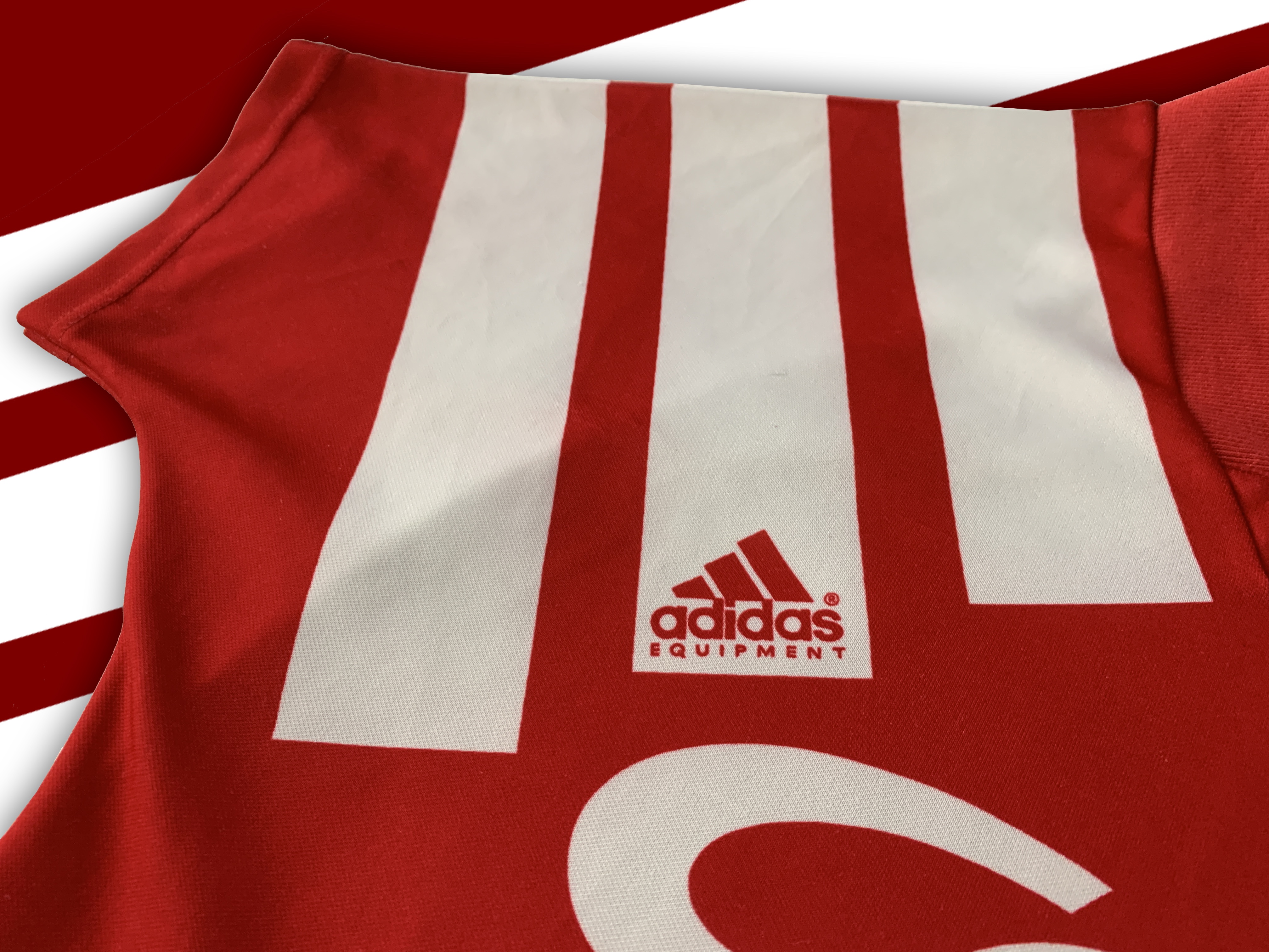
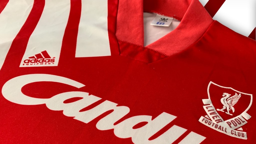
Fitting, then, that Adidas modelled their new ‘Equipment’ logo to look like a mountain. It’s supposed to represent the challenges that athletes have to overcome. However, the mountain looks like a molehill hidden away in the shoulder stripes that dominate the shirt.
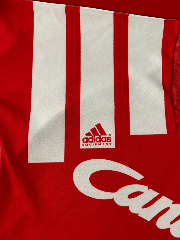
Kit manufacturer logos usually play third wheel to the club crest and sponsor on a shirt. This kit flipped that idea on its head, Adidas were now hogging the limelight, the Liverpool players had been reduced to walking billboards for the new EQT style.
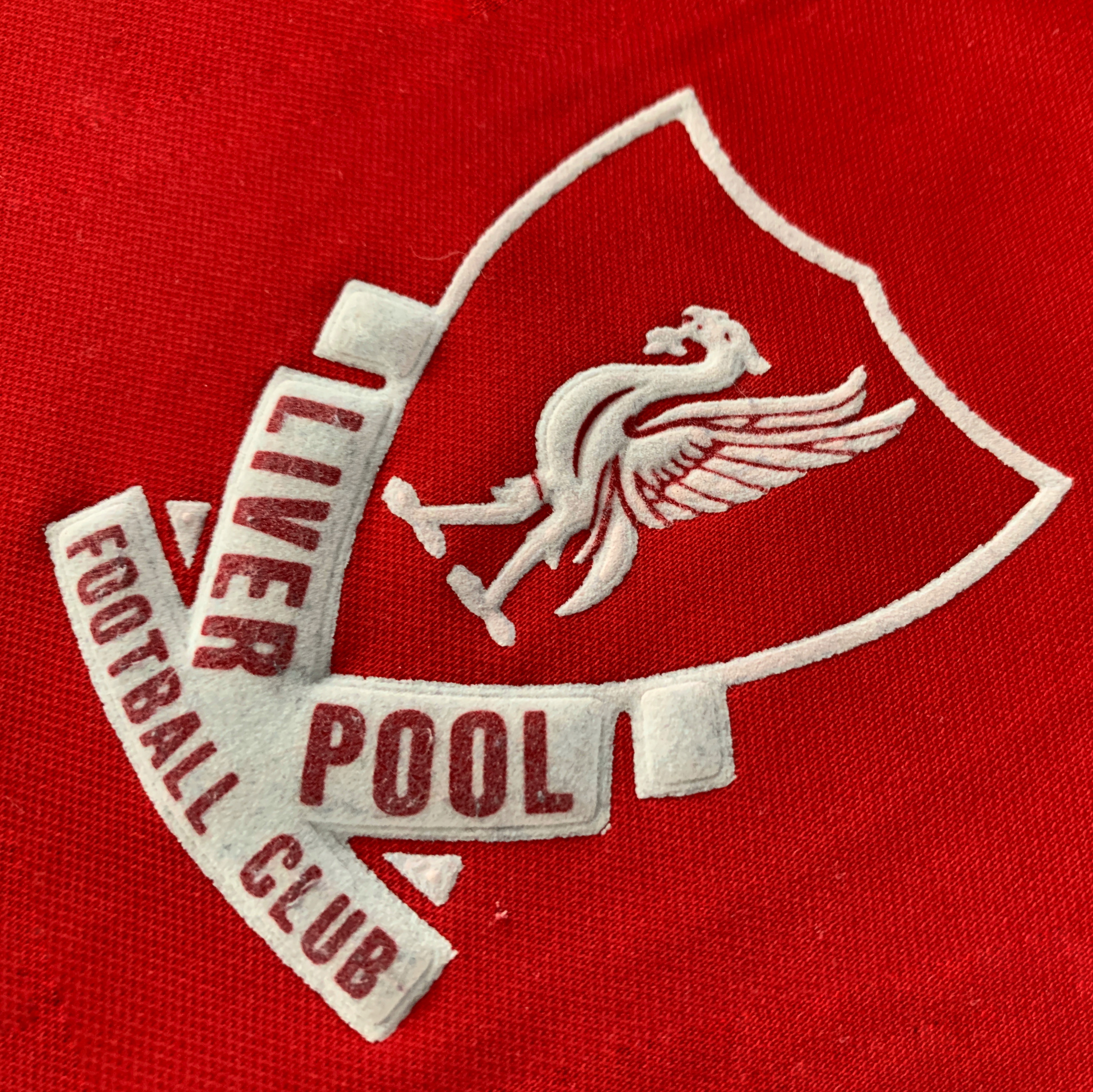
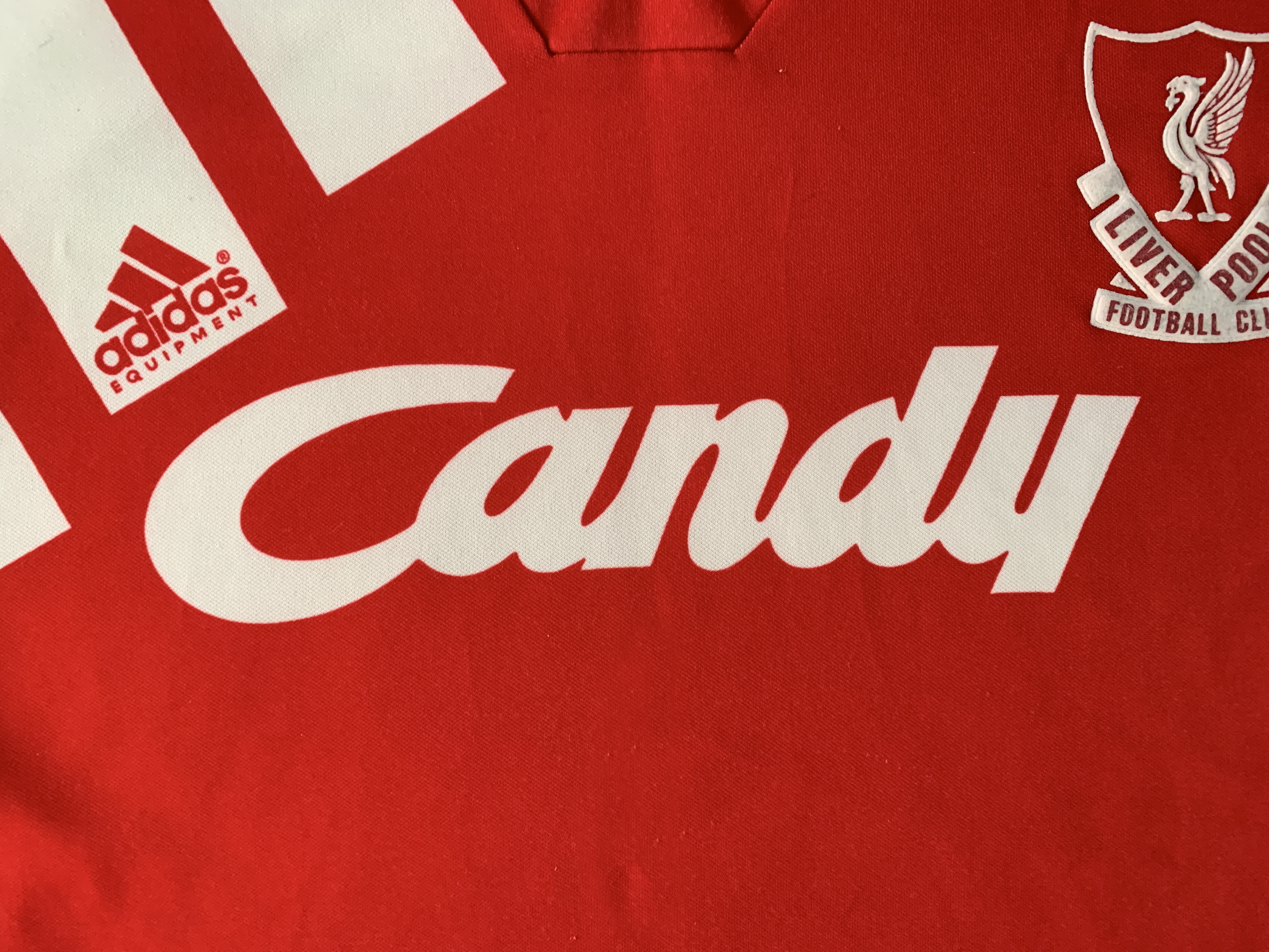
Whatever your opinion about Adidas’ attention seeking design, this shirt is still an important one in LFC kit history. It marks the last time this simplified version of the LFC crest would be used, replaced with the Shankly gates version for the centenary kit the following year. Liverpool would also be saying goodbye to Candy as a sponsor, starting their iconic, long standing partnership with Carlsberg the next season.
It was also the end of an era for Liverpool’s footballing dominance. Eliminated in the quarter finals of the UEFA cup, dumped out of the League Cup by third division Peterborough and finishing 6th in the league with a performance so unpredictable and inconsistent that Graeme Souness had a heart attack just to get out of managing them. Liverpool did have a bright spot that year when they lifted the FA Cup for a 5th time, but it would be their last major trophy until 2001.
Finishing outside the top 2 for the first time in a decade, Liverpool were setting the tone for their next decade in the upcoming Premier League. I’m not saying template kits caused their form to dip, but when they were on top in the 80s they had some lovely, bespoke kits…
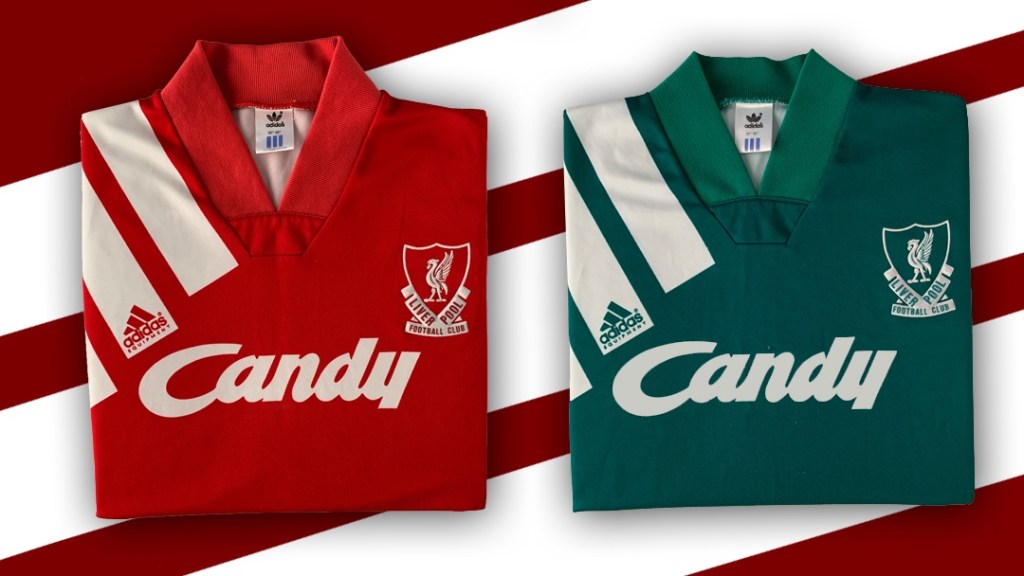
However, Adidas were obviously fond of this design as they used it for the away kit too, in green. And they were green in more ways than one when they recycled both shirts the following season, with a few minor tweaks.
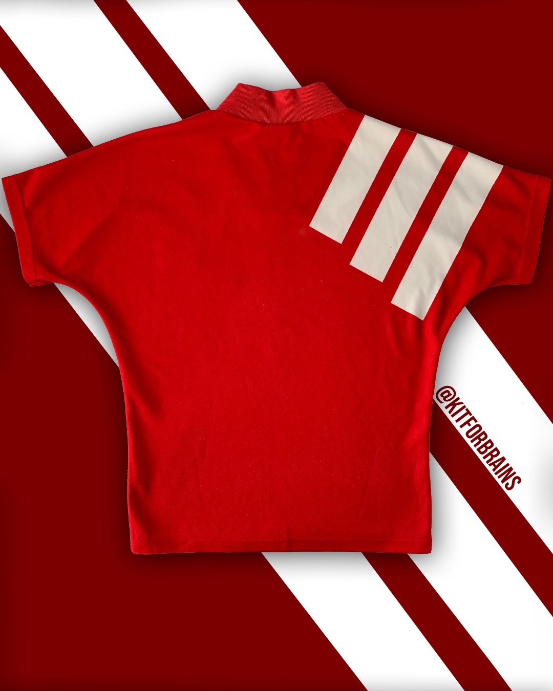
Still, at least the three stripes are quite stylish in their own way. It’d be different if it was a big Nike swoosh over the shoulder. Or if they were supplied by Le Coq Sportif.
Because no one wants a giant Coq on their shirt.
If you liked this, remember to follow @kitforbrains on Twitter and Instagram!

Leave a comment