People who say Americans don’t understand irony have never seen their version of ‘football’. The ball isn’t round for a start and it’s mostly played with the hands rather than the feet. Or at least I think so, the rules are more complicated than quantum mechanics and twice as boring. The ‘offence’ have to advance 10 yards with the ball in 4 ‘downs’, however if the ‘defence’ wins the ball in that time then they become the ‘offence’ and can score by zzzzz…
While the game itself may be a cure for terminal insomnia, everything around it is quite exciting. They have cheerleaders, fireworks and fighter jets. All the teams have brash names like the Jaguars, Raiders and Broncos. And every now and again at halftime, Beyonce will come out and sing a song.

One day, someone at Warrior Sports saw that England has its own football leagues. This must have made the Americans very excited. “Hell, ain’t we got some old jersey designs that we never used for the Chattanooga Seahorses? Sell ’em those! Yee-haw!” Or something.
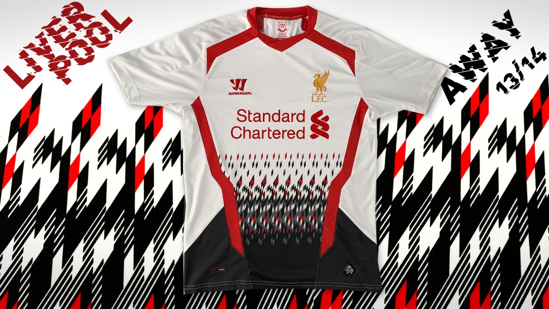
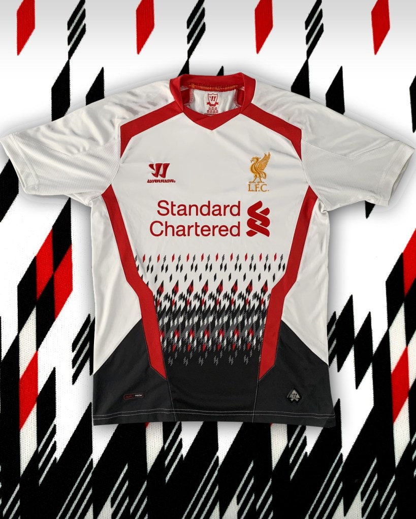
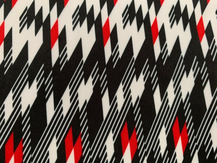
This kit certainly feels like it could be at home on the gridiron. The diamond pattern on the lower third is very audacious and in your face, the bold, blood red slashes frame the torso nicely and provide a nice contrast with the white base colour.
I did read somewhere that pattern on the shirt is supposed to be based on Liverpool’s iconic 89-91 ‘Candy’ sponsored away shirt. And it looks exactly like that, if it was described to a blind man and then drawn by his guide dog.

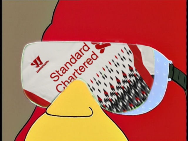
The goggles do nothing
It’s also been described as a Christmas jumper, like TV static, and reminiscent of Space Invaders. It looks like the shirt was supposed to be black all over but the printer started running out of ink halfway through. Mercifully, they decided not to repeat the pattern on the back of the shirt.
If you believe the press blurb, this kit emulates the wild designs of the 1990s. Everybody believes the 80s is the decade of excess, but in football shirt terms, the 90s is hard to beat. The decade that gave us the iconic Bruised Banana, the Hull City’s ‘Tiger stripes’, and Jorge Campos’ goalkeeper kits. In comparison this shirt seems pretty tame, which is why I think its given an unfair rap.
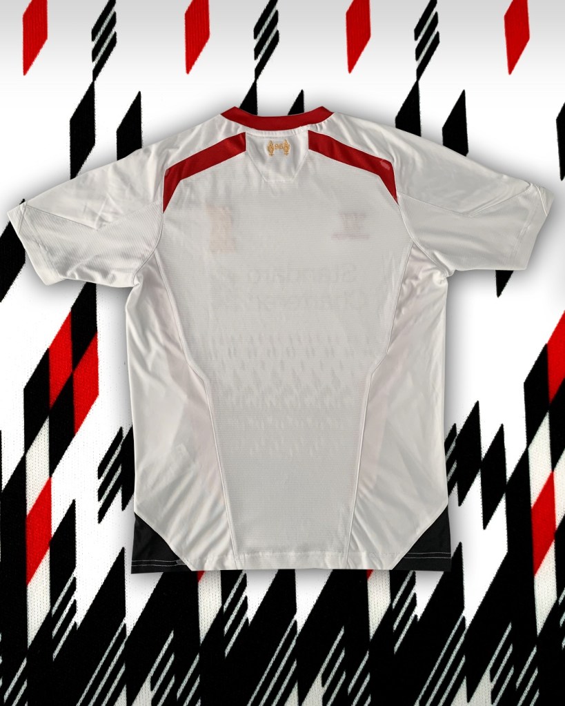
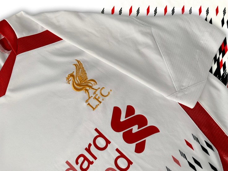
Let’s try and see the positives. The colourway is actually pretty smart, white, red and black go very well together, and teamed with the gold crest the whole ensemble looks a lot like the double winning ‘81 away kit.
The shirt was worn on a few memorable occasions, including a 3-0 win over Manchester United at Old Trafford. However it was also on the scene of the crime in the infamous ‘Crystanbul’ 3-3 draw at Selhurst Park, the final nail in the coffin of Liverpool’s title hopes that year.
A lot of kit fans clamour for the return of 1990s boldness to shirt design, but when Warrior gave it to us in this, we weren’t ready. I think time has been kind to it though, so while it looks a bit like an NFL jersey, at least it isn’t boring – the most heinous crime a shirt can commit.
Follow @kitforbrains on Twitter and Instagram

Leave a comment